White Space Usage
The empty space on a page is not wasted — it is working. White space directs attention, reduces fatigue, and increases the perceived value of everything it surrounds.
Crowded vs. considered
The same number of products. A radically different experience. See how spacing transforms perception instantly.
Three levels of white space
White space is not a single concept — it operates at micro, mid, and macro scales simultaneously.
Micro Space
The space between letters, lines, and small UI elements. Controls legibility and the comfortable pace at which text is absorbed.
Component Space
Padding inside cards, buttons, and product tiles. Determines the perceived quality and luxury feel of each individual element.
Macro Space
Margins between sections, page breathing room, and the space that separates page regions from one another. Sets the overall tone.
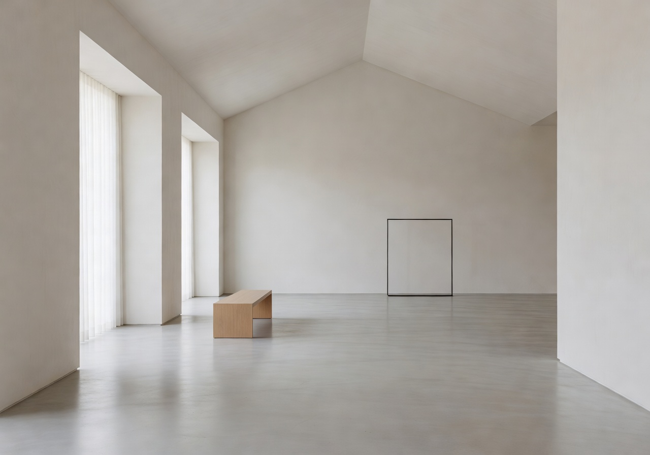
The most admired stores are the emptiest ones
Apple stores, luxury boutiques, art galleries — the world's most visited retail spaces share one thing: generous, intentional emptiness. This principle translates directly to digital storefronts.
When we add 40% more breathing room to a product page, we typically see a 15–25% lift in perceived product quality scores in customer surveys.
The 8px spacing scale
Every gap in our designs is a deliberate multiple of 8 pixels. This creates mathematical harmony that the eye perceives as refinement.
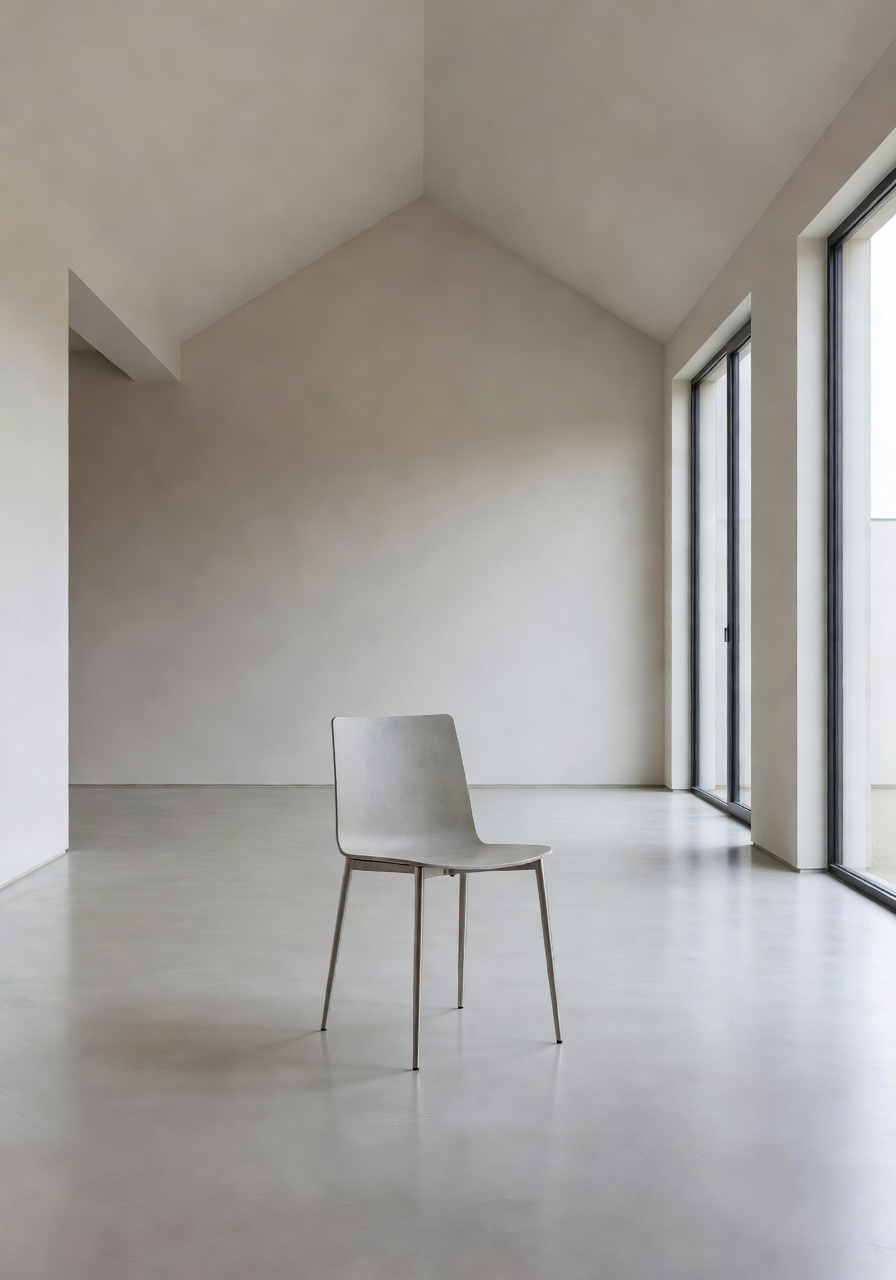
Space communicates value before a customer reads a word
The density of a layout is one of the strongest brand signals a store sends. Dense, packed layouts signal "discount". Open, spacious layouts signal "premium".
We use space deliberately to position our clients' products at the right price point perception — before a single word of copy is read.
"White space is like air — you don't notice it when it's there, but you immediately feel when it's gone."— Minimal Clean Design Philosophy, 2026
Give your store room to breathe
A spacing audit takes 48 hours and typically delivers an immediate improvement in session duration and conversion rate.
Request a Spacing Audit