UX Clarity
Clarity in UX means a shopper always knows where they are, what they can do, and what happens next. Confusion costs conversions — every time.
The five-step clarity model
Every touchpoint in the shopping journey must answer one question: "What should I do next?" Our five-step model ensures the answer is always visible.
Arrive
Clear hero. Immediate value proposition. One action above the fold.
Browse
Logical category navigation. Products without visual clutter.
Consider
Product page with clear images, pricing, and key info — no distractions.
Commit
Single CTA. No competing links. Trust signals (no dark patterns).
Purchase
Minimal checkout. Auto-filled where possible. One page preferred.
Six pillars of UX clarity
These six principles underpin every UX decision we make — from navigation structure to checkout micro-copy.
Clear Navigation
Maximum 5 top-level navigation items. Every label is a noun, not a verb. No mega-menus hiding products behind hover states.
Fast Feedback
Every interaction — adding to cart, applying a filter, submitting a form — responds within 100ms and confirms success visually.
Visible Progress
Multi-step processes (checkout, registration) always show a progress indicator. Users should never wonder how far they are from completion.
Trust Without Noise
Security badges, return policies, and trust signals placed where they matter — near the CTA — not plastered across every page element.
Helpful Micro-copy
Every form label, error message, and button label is written to reduce hesitation. "Place Order" converts better than "Submit".
No Dark Patterns
No hidden fees, no pre-checked upsells, no fake urgency countdowns. Clarity builds long-term trust and repeat purchase rates.
Clear interfaces reduce support volume by 40%
When customers can't find information or complete tasks intuitively, they email support. Clear, well-structured UI means fewer questions — and a customer support team that can focus on genuine complex issues.
We measure UX clarity by task completion rates in user testing, not by what designers think looks good.
Friction points we fix
The same issues appear across almost every store we audit. Here's what we find — and what happens when we fix them.
| Friction Point | Common Symptom | Our Fix | Typical Impact |
|---|---|---|---|
| Cluttered product page | High bounce, low add-to-cart | Remove 60% of non-essential elements | +32% ATC rate |
| Multi-page checkout | Cart abandonment >70% | Single-page checkout with progress bar | −28% abandonment |
| Confusing navigation | High exit on category pages | Reduce to 5 top-level items, clear labels | +41% category CTR |
| Missing trust signals | Low conversion on first visit | Add returns + security near CTA | +18% first-visit CVR |
| Slow feedback on actions | Repeated clicks, frustration | Instant visual confirmation states | −55% form errors |
| Mobile text too small | High mobile bounce rate | Minimum 16px, 44px touch targets | +24% mobile CVR |
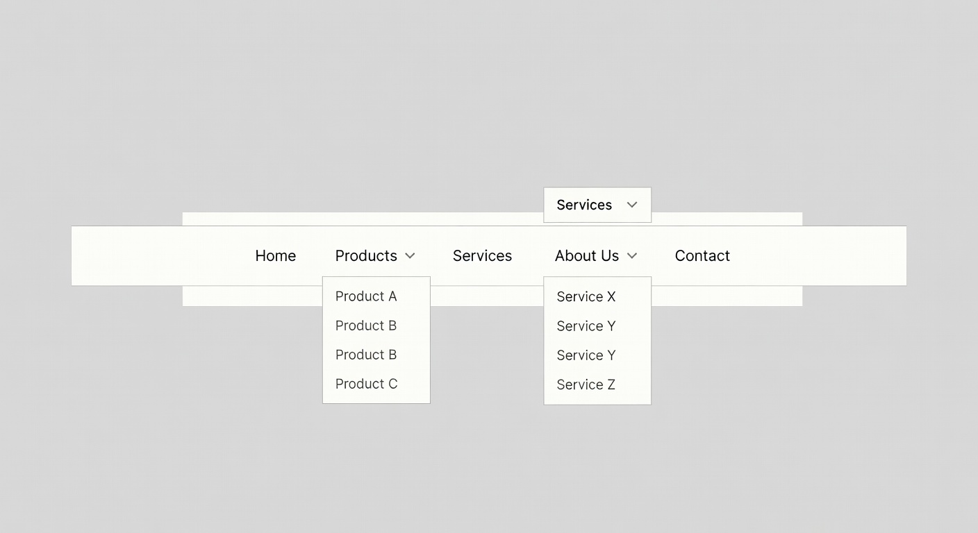
The navigation that gets out of the way
Our navigation design philosophy: five items maximum, zero dropdown mega-menus, and a search function that actually works. When shoppers can't find something, they leave.
We redesign navigation by analysing actual click and search data — not by guessing what categories make sense to the brand.
Eliminate friction, increase clarity
A UX clarity audit maps every friction point in your customer journey and prioritises fixes by revenue impact.
Book a UX Audit