Minimal Layouts
Grid-based, breathable structures that put products front and centre while removing every visual distraction that doesn't earn its place.
Three layouts that convert
Every eCommerce scenario maps to one of these foundational structures. The key is choosing the right one — and then applying it with discipline.
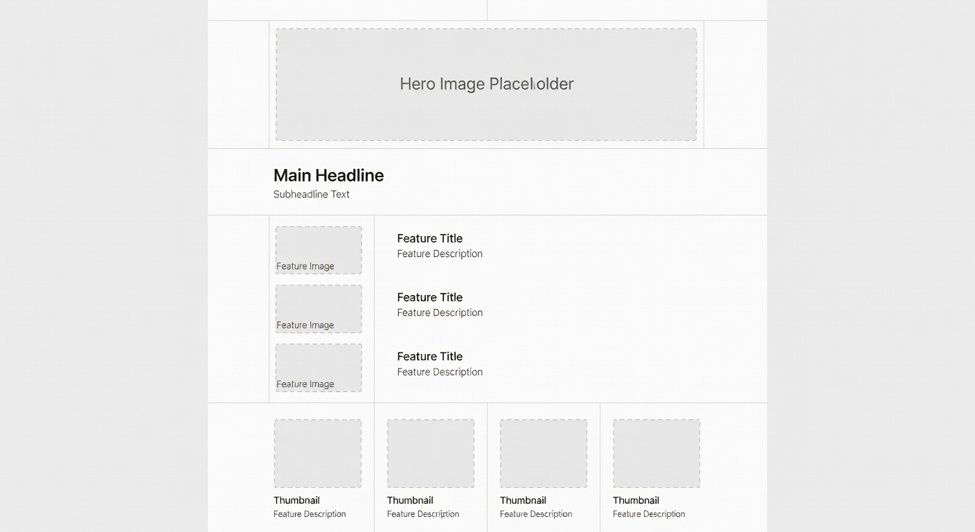
Product Grid
Clean symmetric or asymmetric grids that let products breathe. Optimal for collections and category pages with 4–24 SKUs.
Hero-Led Single
One full-width hero image or product, supported by minimal contextual elements below the fold. Perfect for flagship products.
Editorial Split
Left-weighted content alongside right-side product tiles. Tells a story while maintaining shopping momentum.
The mathematics of clean space
Our grid system uses an 8px base unit. Every spacing value — padding, margin, gap — is a multiple of 8. This creates invisible harmony throughout the layout.
2-Column Grid
3-Column Grid
4-Column Grid
Structure creates perceived quality
When layouts are visually consistent, shoppers subconsciously trust the brand more. A well-applied grid communicates that a brand is organised, reliable, and worth buying from.
We audit every page for grid consistency before any design decisions about colour or typography are made. Structure first, decoration never.
Numbers don't lie
Audit your current layout
We'll review your store's grid structure and identify the top three improvements that will lift conversions.
Request a Free Audit