Typography
Type is the voice of your store. Two typefaces, rigorously applied, create a system of visual hierarchy that guides every reader from headline to checkout.
The Minimal Clean type scale
Built around Syne for display and DM Sans for body. Every size step is a deliberate ratio — not a guess.
Typeface combinations that work
We maintain three approved typeface pairings for different brand personalities within the minimal design framework.
The Modernist
Our default pairing. Geometric boldness in headings, neutral warmth in body copy.
RecommendedThe Luxe
Serif display against sans-serif body creates a timeless, editorial contrast.
Luxury BrandsThe Purist
One typeface family expressed through weight and size contrast. Nothing else.
Ultra-Minimal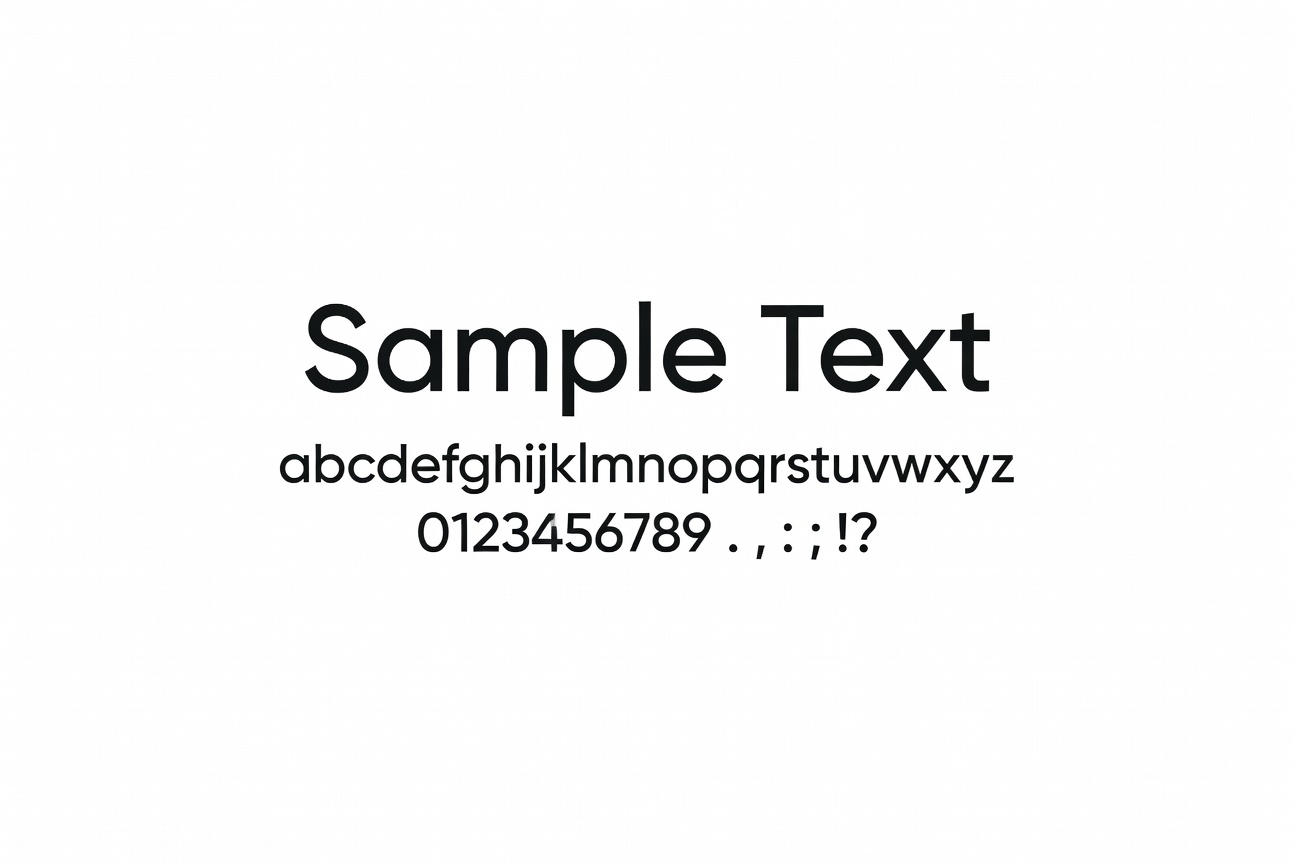
The eye reads in order. Design the order.
When a visitor lands on a product page, their eyes trace a Z or F pattern, picking up key information within seconds. Our typographic hierarchy is designed around this exact scan pattern.
Product name → Price → Key benefit → CTA. The type sizes, weights, and colours are set to reinforce this exact reading sequence every time.
Our typography rules
Two typefaces maximum
Every additional typeface adds visual noise. Two families, differentiated by weight and size, provide all the variety needed.
Minimum 16px body text
Especially on mobile. Anything smaller than 16px reduces read-through rates by up to 40% on small screens.
Line length: 60–80 characters
The optimal line length for comfortable reading. Too wide or too narrow both cause fatigue and scanning instead of reading.
Text colour is #1A1A1A, never pure black
Pure #000 on white creates harsh contrast. Our near-black softens the reading experience without losing legibility.
Line height 1.7–1.8 for body
Adequate leading prevents text from feeling dense and intimidating. Product descriptions with 1.8 line height get read further.
Small typographic decisions make outsized differences
Tight letter-spacing on large headings (-0.03em) makes display type feel premium and intentional. Generous tracking on labels (0.1em) makes UI elements scan faster.
These micro-decisions take minutes to implement but permanently elevate the perceived quality of every page they touch.
Upgrade your store's voice
A typography audit and system setup takes one week and transforms how every word on your site is read.
Start a Typography Project