Product Focus
Every design decision should ask one question: does this help the product shine, or does it compete with it? The product is always the hero.
The minimal product detail page
No popups, no chat widgets, no promotional banners. Just the product, its story, and a single clear action.

The Aoyama Chair
Designed in Tokyo, made in Kyoto. Solid white oak frame with hand-finished natural linen cushioning. Every piece carries subtle variations that make it uniquely yours.
Free shipping · 30-day returns · Handmade to order
What product focus means in practice
Specific, actionable rules we apply to every product page and collection layout we design.
One image per fold
Above the fold, one product image dominates at full width or 60%+ of the visual field. Secondary thumbnails live below or in a small carousel.
No competing CTAs
One "Add to Cart" button per page. Wishlist links are text-only. No "Shop the Look" banners interrupting the purchasing flow.
Photography is king
Product photography on white, grey, or contextual lifestyle backgrounds. No busy patterns, no text overlays on product images.
Context beneath, chrome above
Product name, price, and CTA always above the fold. Reviews, shipping info, and related products live below — never competing for the initial viewport.
Kill the banner ads
Promotional banners, loyalty badges, and countdown timers are removed from PDPs. On the product page, trust comes from the product, not urgency tricks.
Navigation fades to minimal
On product detail pages, the navigation reduces to logo + cart icon only. Every other nav item shrinks or hides to eliminate escape routes during purchase consideration.
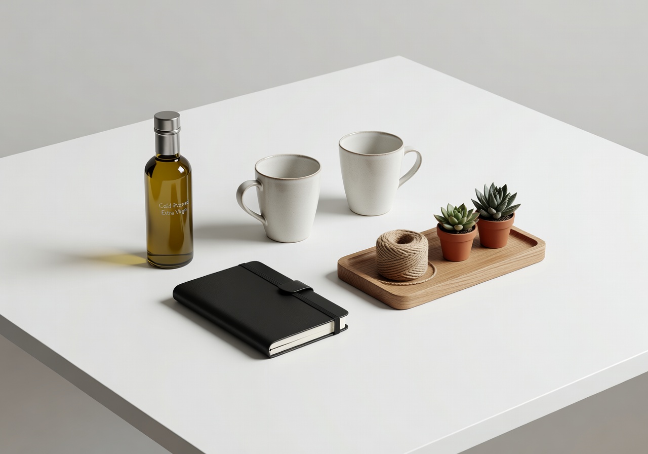
The silent salesperson: product photography
Before a customer reads your copy, they've formed an opinion based on the image. Clean, well-lit product photography on a neutral background communicates quality instantly.
We work with our clients to define photography standards that align with their brand positioning — specifying background tones, shadow style, cropping ratios, and image sequencing.
Let your products speak
We audit product page layouts and redefine the visual hierarchy so every product gets the spotlight it deserves.
Start Your Product Audit