Less clutter,
more conversions
Minimal Clean helps eCommerce brands strip away the noise and build stores that guide customers effortlessly from discovery to purchase.

Design rooted in restraint
Every pixel earns its place. We apply six core principles to every store we touch — removing what distracts and amplifying what converts.
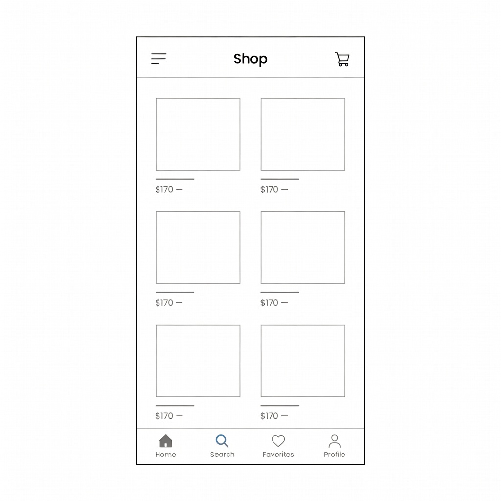
Grid Discipline
Consistent columns and margins create visual rhythm that guides the eye without conscious effort from the shopper.
Purposeful White Space
Breathing room between elements reduces cognitive load and draws attention to what matters most — the product.
Type Hierarchy
Two typefaces maximum. Clear size contrast directs readers through content in the exact order we intend.
Single CTA Rule
One primary action per page. Competing buttons dilute intent — we choose the one that moves visitors forward.
Product Primacy
The product is the hero. Navigation, banners, and decorative chrome all fade respectfully into the background.
Friction Removal
Every checkout step, form field, and micro-copy is audited to remove invisible barriers that prevent purchase.
Removing clutter directly increases conversions
Cognitive science is unambiguous: the more choices a visitor faces, the less likely they are to act. Our minimal design framework reduces decision fatigue and channels attention toward purchase intent.
- Layouts with fewer than 6 visual elements per fold perform 28% better
- Products shown in clean environments are perceived as higher quality
- Streamlined checkout reduces cart abandonment by up to 35%
- Mobile-first minimal layouts cut load time by an average of 4.2 seconds
Insights on clean design
Why Grid Systems Are the Foundation of Every Great Store
Without a grid, design is guesswork. Here's how we structure every project from the first wireframe onward.

The Paradox of Choice: How Fewer Products Sell More
Reducing SKU visibility on your homepage can dramatically increase add-to-cart rates. Here's the data.
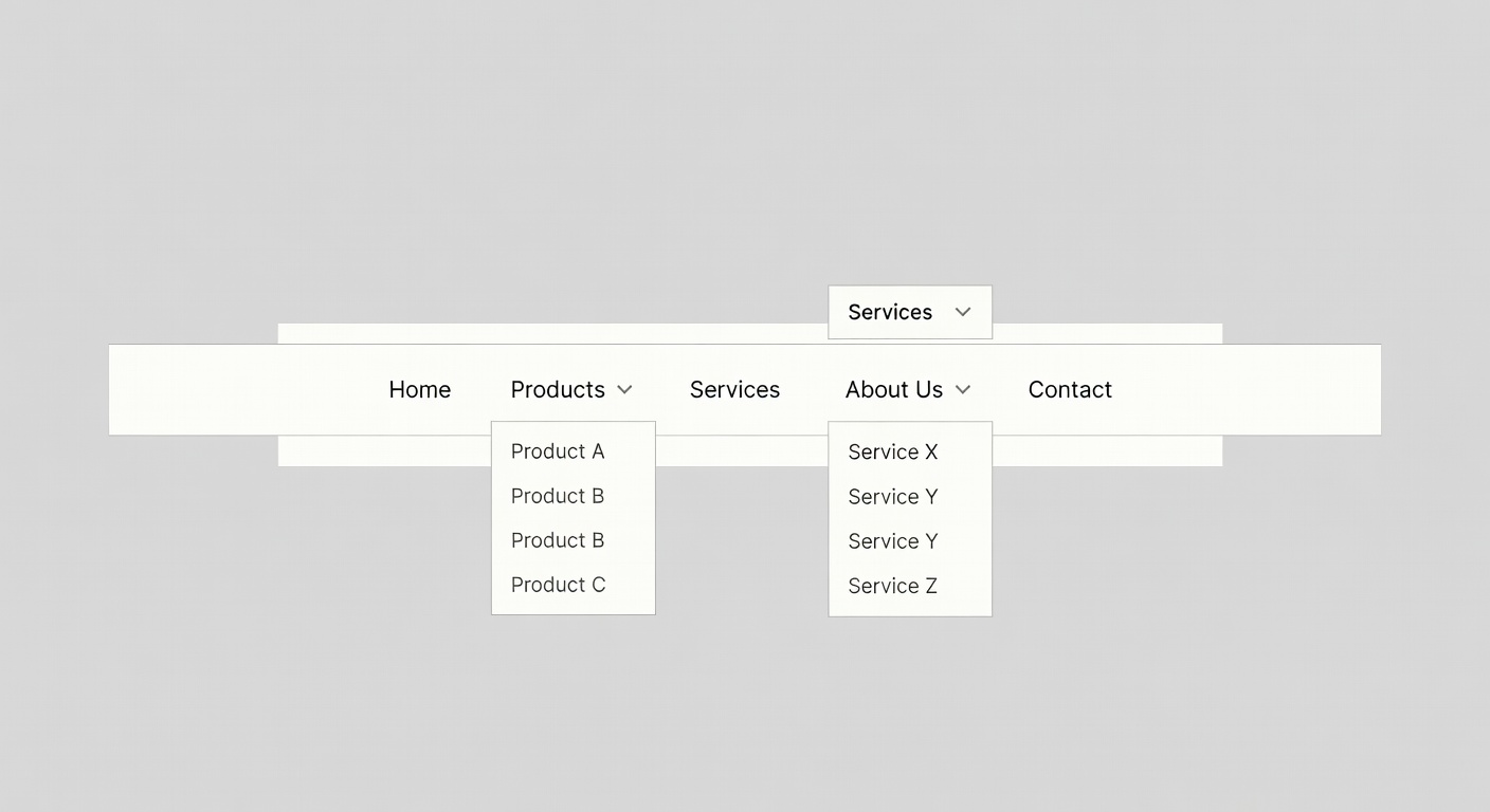
Navigation That Disappears: The Art of the Invisible Menu
The best navigation systems go unnoticed. Shoppers find what they need without thinking about how.
Ready to simplify
your store?
Join 200+ brands that have stripped back the noise and watched their conversions climb.
Start a Conversation